
By Will Flanders, PhD, and Noah Diekemper
Annually, when Wisconsin’s new school report cards are released, we learn that Wisconsin’s schools must all be located in Lake Wobegone, where everyone is above average. School districts like Beloit (14.1% proficiency in reading) and Milwaukee (11.5% proficiency in math) are somehow not judged to be deserving of a ranking in the lowest category on the report card. This year, Milwaukee even managed to reach the middle category of “Meets Expectations.”
There are a number of reasons that this seems to happen every year. Each school and school district receives an overall score on a 100 point scale. – Those scores are then put into accountability rating categories at certain cut points. DPI has the power to set these cut points. The cut points from this year’s report card are reproduced in Table 1 below.
Table 1. DPI Report Card Categories

As recently as the 2020-21 school year, DPI moved the cut points for each rating, which had the effect of moving some districts up in their rating despite not showing any measurable improvement.
But the reality is that the chief cause of this phenomenon is state law that requires us to not judge school districts on a level playing field. In districts with more low-income students, student proficiency is weighted less highly than it is in districts with fewer low-income students. Instead, student growth is weighted more highly in high poverty districts. There are other components that go into the report card score as well that include outcomes for target groups and graduation metrics, but only between growth and achievement are weights varied in this way.
It is important to note that student growth is a vital factor to consider when evaluating school performance. Though there is a great deal of complexity in how growth is calculated, in it’s simplest terms, it is a measure of the extent to which students have improved their performance from one year to the next on the state test for their grade level. The justification for weighing growth more heavily in districts with more low-income students is in recognition of the reality that these students are often behind academically and need to be “caught up.”
The change in the weight given to growth on the report card is quite dramatic. Table 2 pulls in information from a DPI Calculator, and shows the change in the weight of growth and proficiency as we go from a district with 5% low-income students to one with 100% low-income students. In a district like Milwaukee with more than 82% low-income students, proficiency barely matters for their overall score at all.
Table 2. Growth/Proficiency Weights Based on % of Low-Income Students

The biggest problem with this system is it makes comparability of report card performance across school districts nearly impossible. While it is laudable that some districts are doing quite well helping students catch up, there is little utility in that for parents in trying to assess whether a school district (or private school in the choice program) is right for their kids.
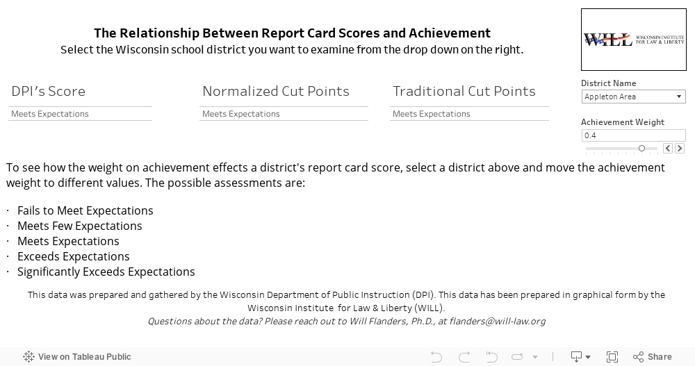
Fortunately, the fix for this is quite straightforward: rework the formula so that the weightings of these factors don’t vary between school districts. We have created a tool below that illustrates the change in Forward Exam results that would happen in each district as the weighting of achievement and growth varies.
In addition to the original DPI score labeled “DPI’s Score,” we present two sets of cut points: one is the same cut points as the current report card. This is labeled as “Traditional Cut Points.” The other, labeled as “Normalized Cut Points,” can be thought of as like a professor who grades performance on a curve using an assumption of a normal distribution of grades. To see why this is important, consider the distribution of the current report card ratings below in Figure 1.
Figure 1. Distribution of 2023-24 District Report Card Ratings (Traditional Cut Points)

The vast majority of districts are ranked as “Meets Expectations” or above, and no districts are ranked as “Fails to Meet Expectations.” Figure 2 shows a hypothetical distribution of district-wide report card ratings after they are normalized along a more traditional curve—with more districts appropriately placed in the more extreme categories.
Figure 2. Distribution of 2023-24 District Report Card Ratings (Normalized Cut Points)

Note that the cut points would change every year under a normed system based on school and district performance around the state. A debate can be had on where is the best place to put the cut points. The most important thing is cross-district comparability.
Moving to a system that weighs achievement more heavily would shift districts with extremely low proficiency into lower categories, which would likely seem intuitively appropriate to most people. On the other hand, weighting growth heavily may harm the outcome for districts with extremely high proficiency but less room for student growth. The right answer is likely somewhere in between.
Wisconsin’s report card scores have been rendered all but useless in making comparisons between districts by weighting variation. The intentions behind this system were good in rewarding districts with more challenging students, but its clear there was an overcorrection. It’s time we craft a report card that is a level playing field across the board and can be useful to parents and policymakers.


Noah Diekemper
Senior Research Analyst